



Extended Description
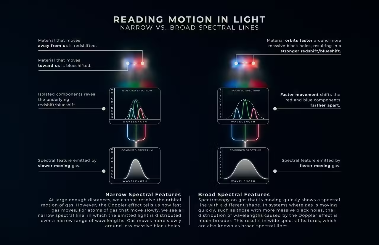
Infographic titled “Reading Motion in Light, Narrow vs. Broad Spectral Lines.” There are two columns. The column to the left details phenomena that cause narrow spectral features, while the column to the right details phenomena that cause broad spectral features.
Left Column
A small illustration of a black hole, which appears as a bright, fuzzy spot at the center of a puffy cloud of dust and gas. The right side of this cloud is red, while the left side is blue. A thin, dark disk of material surrounds the central black hole and is seen edge-on. The red region is captioned, “Material that moves away from us is redshifted.” The blue region is captioned, “Material that moves toward us is blueshifted.”
Underneath the small illustration is a graph labeled “Isolated Spectrum.” The x-axis is labeled “Wavelength,” and the y-axis is labeled “Brightness.” The graph contains three curves. A blue curve and a red curve rise from the bottom of the graph to about one-third of its height before returning to the bottom. Between them is a green curve that slightly overlaps the blue and red curves and rises to about half the height of the graph. A dotted white curve begins to the left of the blue curve, rises to the same peak as the green curve, and descends to the right of the red curve, forming a much broader profile. The graph is captioned, “Isolated components reveal the underlying redshift/blueshift.”
Blue, green, and red lines extend downward from the three colored curves and merge into a single white line that connects to a second graph below, labeled “Combined Spectrum.” The x-axis is labeled “Wavelength,” and the y-axis is labeled “Brightness.” This graph contains a single curve identical in shape to the dotted white curve in the graph above. The graph is captioned, “Spectral feature emitted by slower-moving gas.”
Beneath this graph is text titled, “Narrow Spectral Features.” It reads, “At large enough distances, we cannot resolve the orbital motion of gas. However, the Doppler effect tells us how fast gas moves. For atoms of gas that move slowly, we see a narrow spectral line, in which the emitted light is distributed over a narrow range of wavelengths. Gas moves more slowly around less massive black holes.”
Right Column
A small illustration of a black hole, which appears as a bright, fuzzy spot at the center of a puffy cloud of dust and gas. The right side of this cloud is red, while the left side is blue. A thin, dark disk of material surrounds the central black hole and is seen edge-on. The red region and the blue region are captioned, “Material orbits faster around more massive black holes, resulting in a stronger redshift/blueshift.”
Underneath the small illustration is a graph labeled “Isolated Spectrum.” The x-axis is labeled “Wavelength,” and the y-axis is labeled “Brightness.” The graph contains three curves. A blue curve and a red curve rise from the bottom of the graph to about one-third of its height before returning to the bottom. Between them is a green curve that rises to about half the height of the graph. A dotted white curve begins to the left of the blue curve, rises to the same peak as the green curve, and descends to the right of the red curve, forming a much broader profile. The graph is captioned, “Faster movement shifts the red and blue components farther apart.”
Blue, green, and red lines extend downward from the three colored curves and merge into a single white line that connects to a second graph below, labeled “Combined Spectrum.” The x-axis is labeled “Wavelength,” and the y-axis is labeled “Brightness.” This graph contains a single curve identical in shape to the dotted white curve in the graph above. The graph is captioned, “Spectral feature emitted by faster-moving gas.”
Underneath this graph is text titled, “Broad Spectral Features.” It reads, “Spectroscopy on gas that is moving quickly shows a spectral line with a different shape. In systems where gas is moving quickly, such as those with more massive black holes, the distribution of wavelengths caused by the Doppler effect is much broader. This results in wide spectral features, which are also known as broad spectral lines.”
Image Alt Text
Infographic titled “Reading Motion in Light, Narrow vs. Broad Spectral Lines.” There are two columns. The column to the left details phenomena that cause narrow spectral features, while the column to the right details phenomena that cause broad spectral features.
Source: science.nasa.gov